A tool for visualizing academic synergies

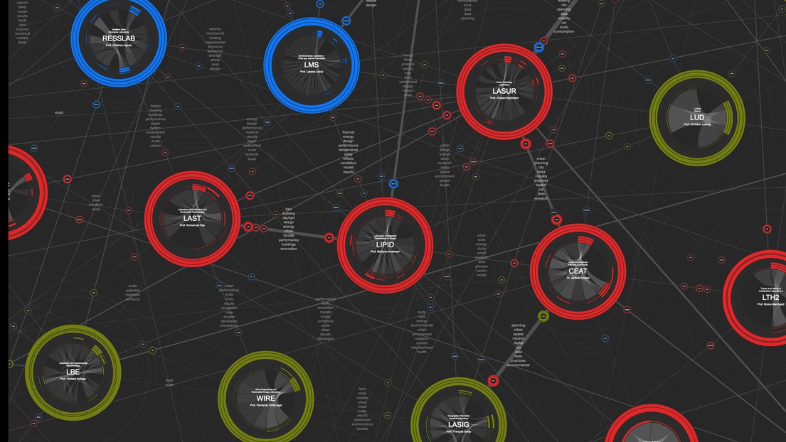
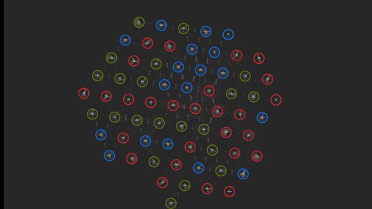
Each ENAC lab is represented by a circle, the color of which indicates the discipline. © EPFL
The Affinity Map showing cross-laboratory collaboration among faculty at EPFL’s School of Architecture, Civil and Environmental Engineering (ENAC) is now available to the general public. One of its creators will soon be heading off to MIT on a grant to expand his idea to a global scale.
Scientists around the world are excited about the new possibilities being offered by advanced data collection and processing methods. But making such data understandable and useful to the uninitiated remains a challenge. With its Affinity Map, ENAC hopes to give its faculty a tool for better leveraging the vast amount of data related to their research and teaching. Such a visual method could even make it easier for scholars to share academic knowledge across the entire scientific community.
ENAC’s Affinity Map was driven by the school’s former dean, Marilyne Andersen. It is designed to help ENAC researchers spot potential academic synergies, topics they share with colleagues and possible areas for joint research. The map is fast, intuitive to use and now available to the general public. “This public version is intended to show academic community the potential of data visualization and how it can help encourage research collaboration on a global level,” says Dario Rodighiero, the map’s co-author.
Digital humanities
Rodighiero created the Affinity Map as part of his thesis in digital humanities at EPFL, which was supervised by Professors Frédéric Kaplan and Boris Beaude, and defended in January 2018. The map combines the latest visualization methods with annual data from ENAC, including journal publications, courses given and student supervision. After finalizing his prototype, Rodighiero teamed up with Ogier Maitre, an EPFL computer scientist and cartographer, to turn it into a program that can be used by anyone. Rodighiero’s work will now be extended to an even larger scale, thanks to a grant he just obtained from the Swiss National Science Foundation to conduct post-doc research at MIT so that researchers around the world can benefit from his invention.
What makes Rodighiero’s thesis unique is that it is based on interviews he conducted with ENAC researchers over four years. That means his program is not just easy to use and efficient, but also tailored specifically to their needs. “Marilyne Andersen, ENAC’s former dean, saw the Affinity Map as a tool for visualizing the school as a whole and for facilitating cross-disciplinary research. It was also meant to support the development of new teaching activities – such as for the Design Together program – and new research topics at the crossroads of existing fields. But as we were building the map, we saw that researchers were really interested in seeing their laboratory represented in the Affinity Map, and it became a way of depicting the school through its faculty members. Today they all can use it,” says Rodighiero.
The ENAC galaxy
The Affinity Map looks like a galaxy of some seventy planets, each surrounded by satellites. The planets are the ENAC labs and their color indicates which of the school’s three disciplines they belong to: red for architecture; blue for civil engineering; and green for environmental engineering. The lines between the labs represent any one of three types of affinities: shared teaching subjects; joint project supervisions (including at students, PhD and postdoc levels); and joint publications.
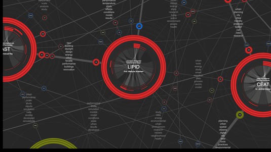
Users can select filters to display only the information that interests them. For example, you can group certain kinds of planets together or arrange the planets in new ways by choosing a particular affinity. You can also zoom in on the map to view a specific lab and its joint research projects with other ENAC labs, which are displayed as satellites around the planet.

The LIPID laboratory and its satellites. © EPFL
Keywords and a search engine
Shared keywords between the planets, used to indicate common research topics, are generated using natural language processing algorithms that comb through the abstracts of ENAC literature published in a given year and identify correspondences.
The map also contains a search engine where you can search by keyword to find out which labs worked on a given topic, like transportation systems or water treatment. You could also use the search engine to screen for a specific discipline, research topic or laboratory. And missing lines between two labs – despite their affinities – could indicate opportunities for collaboration.
The data used to generate the map come from EPFL’s existing dynamic databases, reviewed and updated by the labs themselves through their annual reports. There are private and public versions of the map. The private one, accessible only by ENAC faculty via a password, provides a complete picture of the myriad of ways that ENAC labs work together and makes it easier for people to contact each other. It gives the names of all researchers at each lab, their existing collaborations in teaching, thesis supervision and publications, and current research projects with non-ENAC labs. The public version gives only the names of the head of each lab in order to protect their researchers from any kind of evaluation.
Better than a website
For now the Affinity Map includes only data for 2017. But Rodighiero and Maitre plan to have it be updated every year. “Once it contains several years of data, ENAC faculty can use it to better understand its researchers’ developing careers and where the school is headed – particularly as some labs close, others open and new research topics emerge. The map will help ENAC students, researchers and professors get a better grasp of their environment and the best way to explore it. And for that, the map is more effective than any website,” says Rodighiero.
“The Affinity Map took five years, starting at the beginning of my tenure as dean. The goal is to better understand, and therefore better ‘see’ – literally – the diversity and complexity of a school like ENAC. I’m very pleased it has been made available to the public as an interactive map so that users can discover the synergies and specific subjects that we teach and research. And I’m delighted that the project will continue to be developed both here at ENAC and beyond, reaching all the way to the United States, so that we won’t forget that we are part of greater whole, one that offers increasingly great opportunities to support and learn from each other through new affinities,” says Andersen, ENAC’s dean from 2013 to 2018 and the driving force behind the project.


