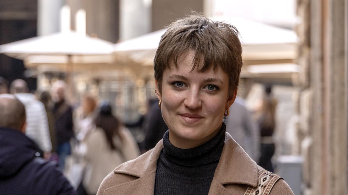
“There are no beautifully-created data sets”

Hannah Casey © 2024 EPFL - CC-BY-SA 4.0
As part of her Master’s degree in Digital Humanities, Hannah Casey spent nearly a year at the Bibliotheca Hertziana in Rome creating a visual map of the library’s catalog.
The Bibliotheca Hertziana, part of the Max Planck Society, is an art historical institute in Rome that holds over 300,000 documents and is consulted by art historians from around the world. To produce a visual map of all the library’s contents, EPFL student Hannah Casey used document metadata to explore the history of the library and better understand research trends and patterns.
“The goal was to give a new way of interacting with the library and library collection,” Casey says.
“The perfect opportunity to learn everything about digital humanities”
Casey’s internship and subsequent Master’s project came about thanks to a completely separate project that she had undertaken: designing the Digital Humanities (DH) Section sweatshirt. As part of the design, she wanted to use a map from the thesis of DH PhD alumnus Dario Rodighiero. At that time, Rodighiero was at the Bibliotheca Hertziana working on a project and he had the idea for library visualization.
“He saw the potential of this library and thought that would be a great project,” Casey says.
This led to Casey’s internship and eventually her master’s project, for which Rodighiero was the thesis supervisor. Initially Casey had just planned to stay for her four-month internship, but ended up staying for nearly a year.
“It was so interesting to work in the same building as art historians and other digital humanists. I was getting so much insight into the field that otherwise I would never get while at the same time pursuing my own project. It was really the perfect opportunity to learn everything about digital humanities while deepening my knowledge of art history.”
For Casey, the project was an ideal combination of her interests in computer science and in art history, which is what led her to the master’s program in Digital Humanities in the first place after getting her bachelor’s in Computer Science from EPFL.
“I’m personally very interested in the arts and humanities, and I was missing that part from my studies,” Casey says. “I always enjoyed the SHS courses the most in my bachelor’s degree, so I realized I needed to find somewhere in between humanities and engineering. The digital humanities degree was a perfect fit, to go on the route of somewhere in between the two, where I have more space for creativity and more space for my personal interests.”
How to visually map a library
The goal of visually mapping is to take the huge amount of data that exists in a place like a library and present it in a way that the data can be easily accessible and approached in a useful way. Normally, to do this, you would take a collection of texts or papers and analyze the semantic similarities through natural language processing to find the way different texts relate to each other using similar topics and words. These can then be arranged in space where they are mapped closer together if they’re similar, and further if they’re dissimilar.
“That would be very meaningful,” Casey says. “But we didn’t have that kind of data.”
Instead, all Casey had was the title, date, and author of the books, which she realized would not produce any new meaning or information. However, she did also have 10 years of user borrowing data, seeing who took out what document and when and for how long, so they could group books together that were borrowed by the same user, and thereby create a map of interaction that users have with the library.
“That’s where it became really interesting,” she says.
Using an unsupervised machine learning technology called “dimensionality reduction”, she was able to project this high-dimensional matrix into two dimensions and create a map. From there, the question was how could they learn something from this map that they didn’t know before?
Casey then took a novel approach of using large language models to group the different titles – which were in many different languages – into clusters and asked the large language model to give names to these clusters.
“It worked surprisingly well!” she says. “It really managed to give good titles to these clusters. “Then I ran the titles by the experts at the library, the heads of departments and their scientific assistants, so all people who are very well-versed with the library and art history. And they were able to pinpoint which researcher produced which cluster of books!”
Although it is not currently a functioning prototype, Casey found it helpful that in the interviews with users of the library, it could show how the institute has been developing over recent years, which topics are interesting, which are emerging, and which are dying down. If further developed, Casey imagines that this mapping could be used to create a recommendation system, the way Netflix does.
“What I learned is that in my studies, we are always presented with beautiful data sets that are already perfect, and then we go in the wild and nothing is like this,” Casey says. “There are no beautifully-created datasets. Instead, you have to run after people and find out where this information is being recorded and why.”