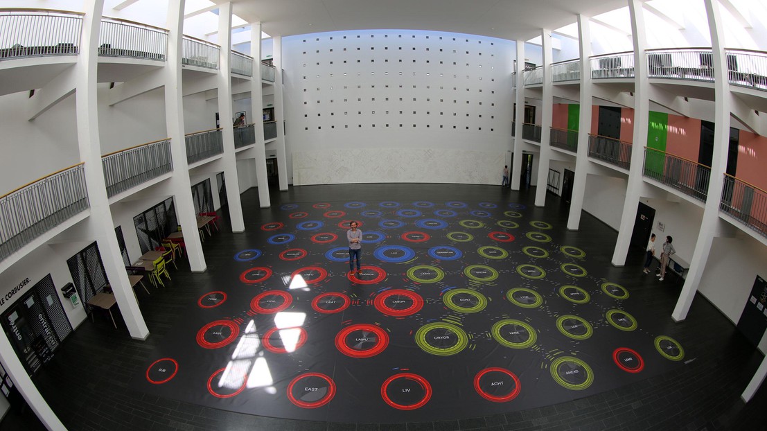
The world's largest data visualization

© 2016 EPFL
Scholars are presented on a large data visualization and they interact with it
The Affinity Map aims to describe the practice of scholars in very large organizations through visualization techniques. The visualization is based on the notion of affinity, which is the reason why people work together, or the way that researchers become connected in the academic field. The outcome is shared with three different audiences: the public, the scholars, and management. In this case, the attention shifts onto the visualization presented to the scholars, who are invited to look for themselves and reflect on their position in the organization.
A very large visualization is created for a public event organized at the EPFL, the Swiss Federal Institute of Technology in Lausanne. The visualization represents about 1000 scholars and 70 laboratories and, consequently, thousands of affinities among them that describe teaching, publications and advising. The visualization, which measures 250 square metres, was printed in collaboration with a company that normally produces tarpaulins for trucks; this is a resistant material that allows people to walk on it. The print was placed in the hall of architecture, a building with a large central space surrounded by two levels of balconies. This configuration allowed us to think about the installation using two types of interactions. Firstly scholars were invited to see the visualization from the balconies, and as a result were able to observe how laboratories work together and how the three institutes of the faculty, which organize laboratories, interact among them. Secondly, scholars walked on the visualization, seeing who forms the laboratories and how the collaboration patterns characterizes each of the laboratories.
The design of the visualization is the result of a study of the faculty. Two main solutions were proposed to show the complexity of the resulting networks. First, networks are generally shown through circles and lines, which represents nodes and links. We identified that nodes are more complex objects, and for this reason each node of the network is represented with a chord diagram. Second, highly connected networks are difficult to read, in particular when they are static – as they are in this case. For that reason, we proposed splitting the graphical representation of the line into two arcs, each of them close to the connected nodes. Arcs show the size, the direction, the type and the name of the link. Moreover, arcs form around a node showing the context of the node itself; looking at a node’s context is like seeing the summary of its connections without going through the lines.
Scholars are able to perceive the entire size of the faculty from the balconies, and are invited to look for themselves when walking on the visualization. By shifting the point-of-view they participate in a zooming movement between a distant and a close view, zooming that will allow them to improve their understanding of each participant in the complex visualization. This movement invites the scholars to see themselves as a process of reconstruction of their consciousness; a sort of personal story of themselves that brings each of them to think about his or her role in the organization, and how they could change their practices inside the organization to shift their representation in a better or different way.
The visualization has been produced at EPFL by Dario Rodighiero (DHLAB / CHÔROS) and Pierpaolo Follia (DHLAB)
— Dario Rodighiero (@dariorodighiero) May 9, 2016


