Shade Me — Smart Blinds

© Shade Me / Designer Sumegha Mantri
Shade Me is a decentralized smart blind system developed by Yujie Wu at the Solar Energy and Building Physics laboratory of EPFL. This is an account of his experience of collaborating with designers in an effort to bring the technology from lab to business.
Yujie, tell us a little about the ShadeMe technology. What makes it special?
Ever been inside a glass facade public library and been bothered by the intense sunlight on your table? Or concentrating on work in your office only to be annoyed by the sound of the window blinds magically moving?
These annoyances are remnants of centrally controlled lighting systems installed in large buildings. Usually in such systems, each blind/window is connected by separate sensors and wires to a centrally controlled system. Since each building is different, the system is custom designed and often installed at construction. This makes it unviable for small scale installation, like a personal office. Other commercially available smart blinds that can be installed at a smaller scale offer very rudimentary levels of light control.
The ShadeMe smart blinds are decentralized, scalable, easy to install and allow precise individual control. Once the preferred light levels are set on the app, the blinds continually adjust and maintain the interior lighting levels. Its advanced glare and lighting control address overheating issues, save energy and provide visual comfort daylight. Overall, the technology is a more economic and user-centric solution.
You collaborated with a video making studio and a UX designer — Why did you need to work with designers?
The first prototype was useful in demonstrating the functionality of the technology, but is was bare bones — a controller box, blinds and a one screen elementary app. In this state, I don’t think any user would have had any idea of how to use it. Besides this, every time we presented the technology, it took us rather long to explain to people what we were doing, its advantages and what set it apart from the existing solutions.
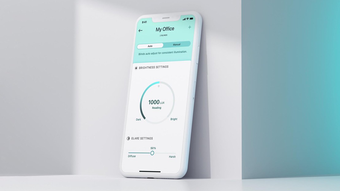
As a next step, it was essential for us to gather feedback from potential users. This required making the technology simple to understand and use, which is why we sought out design expertise. We collaborated with Vandy Studio to make a video and with Sumegha Mantri, a UX designer to develop an initial iPhone app for ShadeMe.

How was your experience collaborating with designers? How did this collaboration help?
Design was the bridge that brought our technology a few steps closer to the the end users.
You know, technology in its early stage can be a bit far away from the user. The theory of a computer algorithm, or the workings of an intelligent system can be quite complex for a non-technologist to understand. This was also the case with our design collaborators. We were already struggling with communicating the technology and it took some time to explain the technology to the designers. This was important because communicators need to understand something properly in order to communicate it effectively to the audience.
The collaborations flourished once this common ground was established. Now we have a sharp video that clearly explains the technology and its advantages. We’ve presented it a few times since and of course, the questions following the presentation have drastically reduced! You can view the video here : https://youtu.be/jnfak6Cf8Xw .
Similarly, the app was designed from scratch, addressing different use cases and functionalities.
Ideas have grown out of our interaction with the UX designer — nuances which had not been thought about earlier were explored and we now have an overall improved product offering.
For example, one of our initial idea was to show the light level settings in LUX (the unit for light intensity)…300, 350, up to 2500 LUX. People could change the value and moderate brightness settings. It was the UX designer’s the perspective that not everyone knows and cares about LUX values! As a result, the app now has different brightness modes (presentation, screen work, reading and detailed work) that people can choose from. In retrospect, these are far more relatable for a layperson.
It is no doubt that the video and the app together have made the ShadeMe technology easy to understand and use. Our presentation and demos are more polished now and this has increased the credibility of our technology.
What’s next for Shade Me?
At the moment, we are working on our website. We’re going to showcase the video and product images on the website to reach potential investors and early adopters. In parallel, we’re improving our MVP. A lot remains to be done to fine-tune our technology and business proposition.
What would you tell your fellow technologists on collaborating with design?
For startups from universities transitioning to the industry, it is rather important to have these different bridges of design adapting the technology to users. You cannot use the physical figures that you published in an academic paper to tell your customers or investors what the technology is really like. Especially for me, coming freshly from an academic background, it was valuable to have this transition — to use a more humane language to tell people what we were doing and what we can do for them. It’s easy to be complex, simplicity is a lot of hard work!
This project was supported by the service Design and Prototyping of the Startup Unit EPFL.