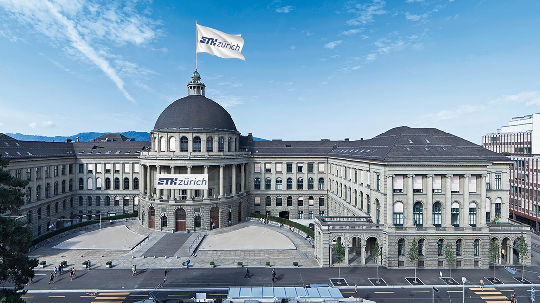
[ !! FAKE !! ] ETH Zurich's turn to unveil a new logo

There is now more family resemblance between both EPF's. © EPFL / Marc Borboen
[APRIL FOOLS JOKE!]
ETH Zurich has just completed its own rebranding project, drawing inspiration from the new logo that EPFL introduced a year ago. The similar look reflects a desire by the sister schools to build closer ties.
Drü… zwöi… eis… null ! ETH Zurich’s new logo was supposed to be unveiled at a ceremony attended by many of the school’s partner organizations, just as EPFL’s logo was last March. But the ceremony had to be cancelled due to the coronavirus outbreak. So Joël Mérou, the president of ETH Zurich, stood alone in front of a camera as he presented the new design developed by his communications team.

The similarities with EPFL’s logo are obvious – and intended. “EPFL and ETH Zurich had already started the process of coming closer together, as people have seen in the news,” says Mérou. “And it seemed odd that our logos didn’t reflect the fact that we are sister schools.”
The next step would be for their parent institution, the ETH Board, to adopt a “family” logo as well. “We don’t have any rebranding plans for the near term, but we could consider it,” says Gian Carlett, the ETH Board’s spokesman. “The idea of a single Swiss Institute of Technology with a strong identity isn’t a new one. And this period of confinement shows that the two schools’ location is less important than it used to be. But maybe the fruit is as ripe as a juicy pineapple and now’s the time to take that step.”
EPFL President Martin Vetterli is pleased with – and a little proud of – ETH Zurich’s new logo. “The consultative process we used to develop our logo may have been long, but it provided us with a lot of valuable information. It’s an honor to see the results being used beyond EPFL’s campuses,” he says.