EPFL web gradually goes responsive

© 2015 EPFL
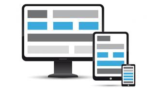
For more reading comfort, the EPFL web layout has now become responsive and can adapt itself whatever the screen used.
At home, in public transport or at work, we are constantly connected on the internet. No need to use a computer anymore: our 'smart' phones provide it. This new habit has an impact on the graphic design of web pages: content must be readable and fits all kind of screens, from the 22-inches to a tiny device easily held in a pocket. An adaptative new design called 'responsive'.
EPFL started to change its web layout: from a design aimed to be displayed on a wide screen desktop to a fluid layout, adapted to nomadic reading.
From now on, the EPFL homepage (www.epfl.ch), news (actu.epfl.ch) as well as events (memento.epfl.ch) can comfortably be read on all kind of devices. The VPSI IT teams, who are doing all the work, now face a new challenge: migrate all EPFL websites (almost 700 sites on the Jahia CMS).