Do we have an unhealthy appetite for pie (charts)?
 et Nicole Vadot ont manié humour et rigueur scientifique. © Murielle Geber/EPFL")
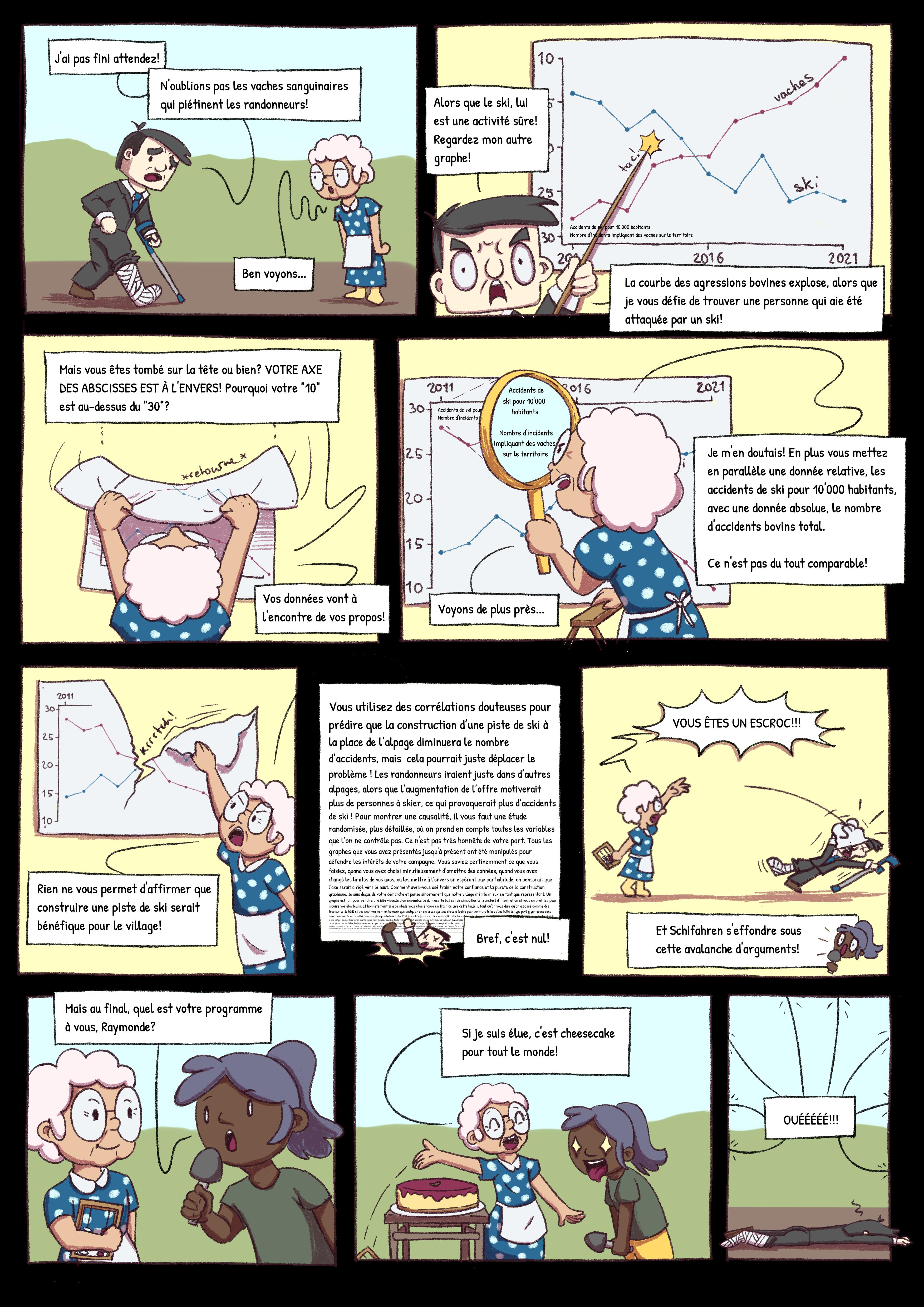
Blandine Moulin (à gauche) et Nicole Vadot ont manié humour et rigueur scientifique. © Murielle Geber/EPFL
Summer series – Semester project. Three university students, as part of their critical data studies class, wrote a light-hearted yet instructive comic strip about perception biases in the presentation of data.
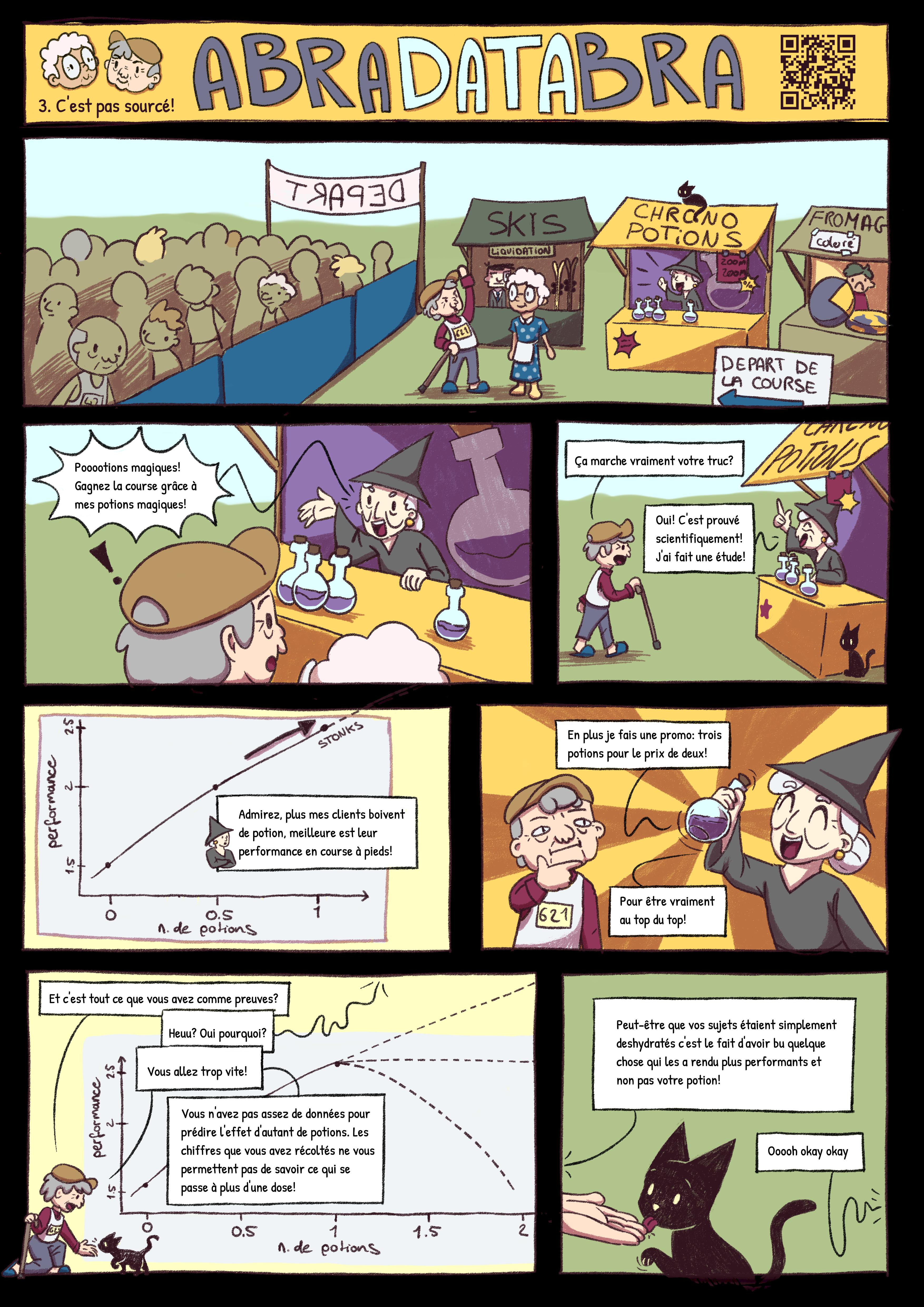
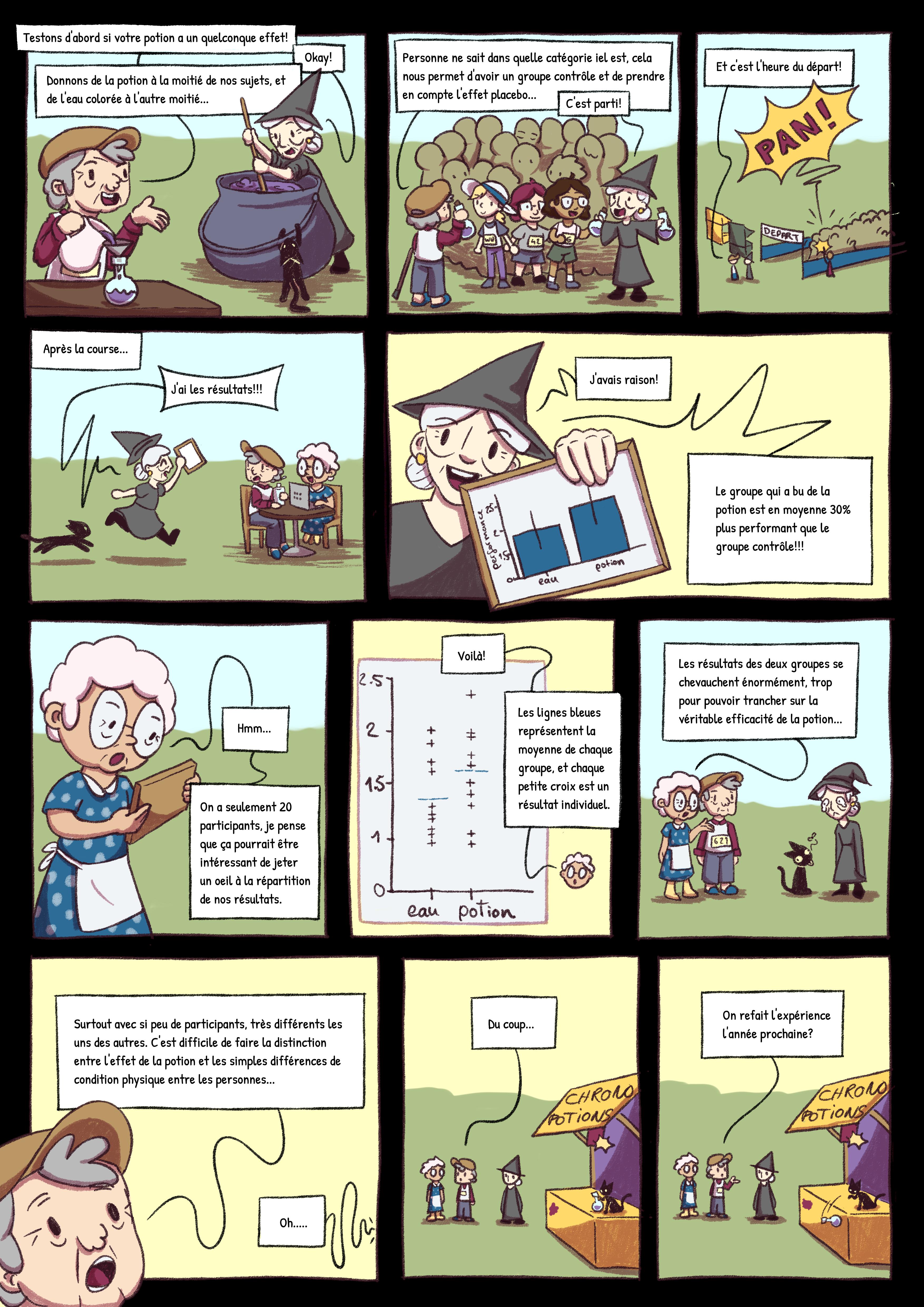
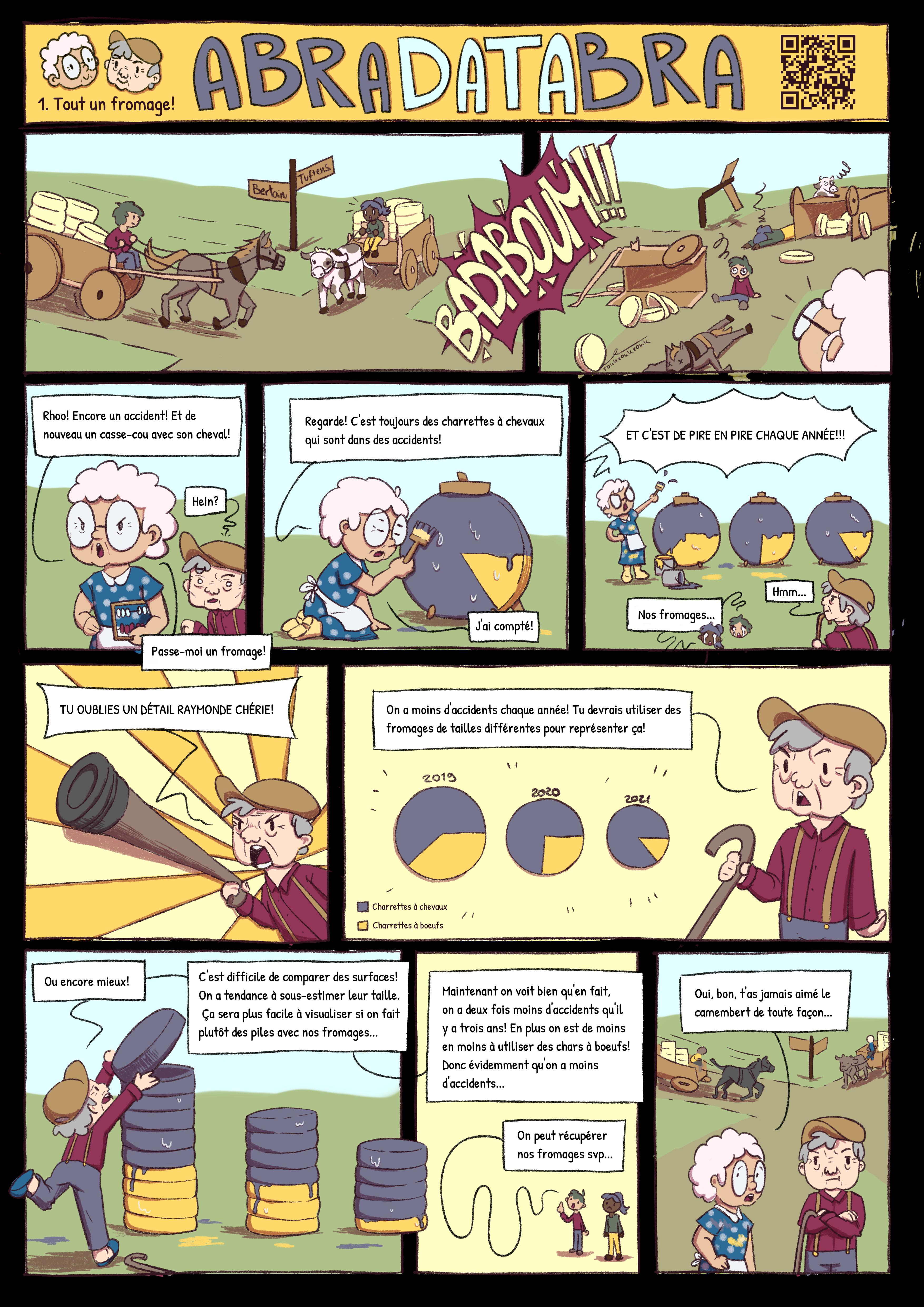
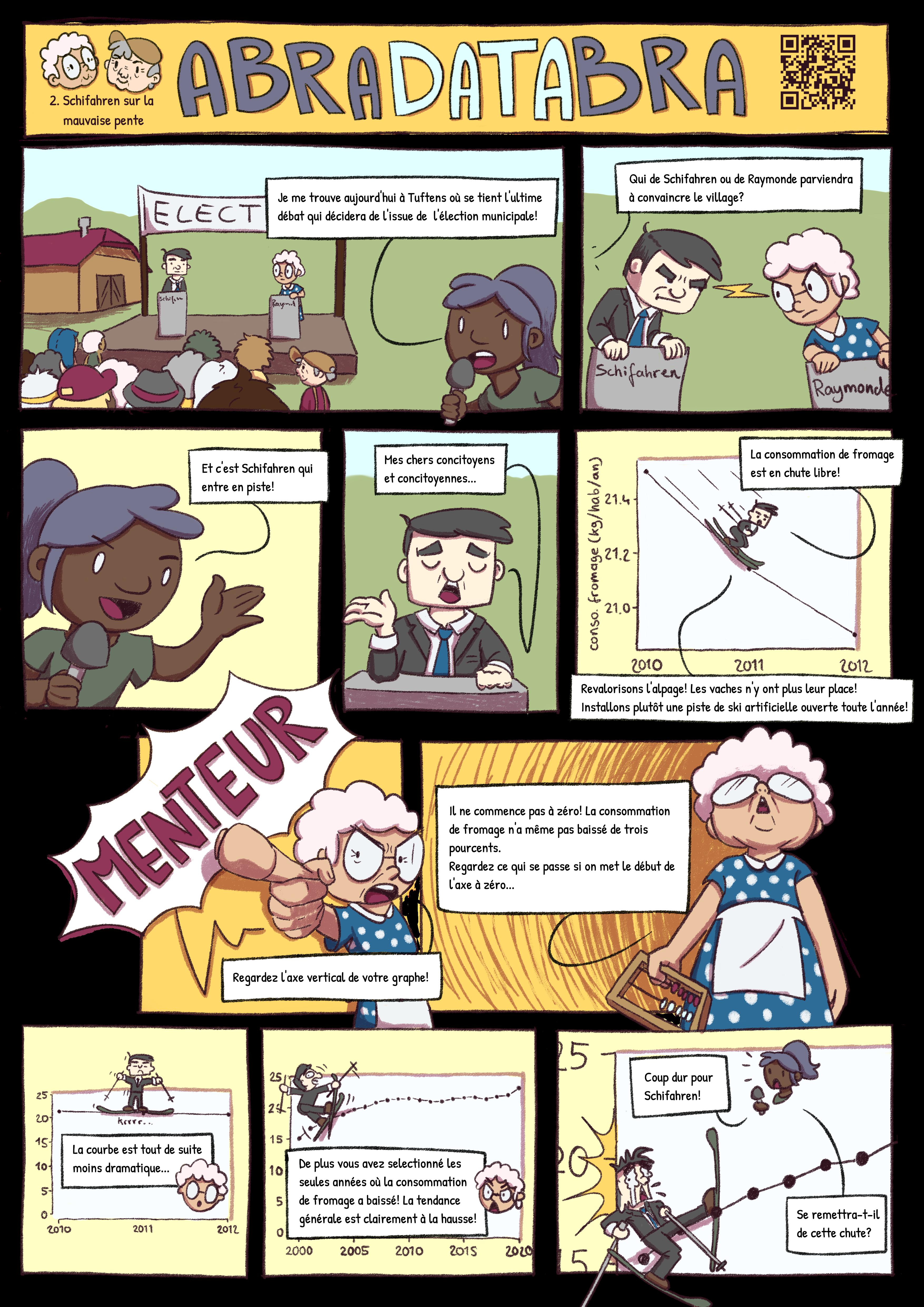
The story starts with two artisan cheesemakers who are hauling their product to market when their carts – one horse-drawn, the other ox-drawn – collide. Raymonde, a 70-year-old woman who witnesses the collision, complains that accidents involving horse-drawn carts, unlike ox-drawn ones, are becoming more frequent. She goes on to back up her premise with pie charts showing the trend is getting worse every year. But Hugues, another bystander from the same age bracket, isn’t so easily convinced. He points out that Raymonde’s pie charts mask the fact that the number of overall accidents is decreasing and that there are fewer and fewer ox-drawn carts on the roads.
The story is told through a skillfully drawn comic strip that’s amusing and instructive at the same time. It was created by a group of three students – two from EPFL and one from the Lausanne School of Visual Arts (Ceruleum) – for their critical data studies class, given jointly by EPFL and UNIL. Nicole Vadot, one of the EPFL students, is pursuing a Master’s degree in physics and has a keen interest in data visualization. In the past few semesters, she has sought to perfect the graphs in her lab reports and has read up on methods for manipulating how data are presented. Zineb Agnaou, the other EPFL student, is pursuing a Master’s degree in applied mathematics; her areas of interest include statistics and techniques for presenting research findings. The Ceruleum student is Blandine Moulin, who “loves drawing little old grannies,” she says. As part of her Bachelor’s degree in illustration and comics, Moulin contributed her artistic talent and non-technical perspective to the project.
The students worked over weekends and school breaks to design three episodes of their comic strip, called AbraDatabra, along with a website(in French only) where it can be viewed online. “With our comic strip, we wanted to shed some light on how charts and graphs can be created and interpreted, so that research results are presented in the best way possible,” says Agnaou. Her colleague Vadot adds: “The idea is to provide tools that just about anyone can use to look more critically at data they’re presented with.” Drawing on equal doses of humor and pedagogy, the comic strip educates readers through examples ranging from toppled cheese carts and magic potions to electoral propaganda.
The group’s website provides details about the charts and graphs they use, whose open-source code is available on GitHub, along with descriptions of the traps to watch out for and tips to avoid getting duped. Such traps include using inverted scales, mixing up absolute and relative values, introducing extrapolation bias, drawing conclusions from small sample sizes, putting forth false correlations, using misleading slopes, omitting data points and excluding information. This all leads back to the key question put forth by the students: do we have an unhealthy appetite for pie (charts)?